For obvious reasons, each room in a house has different color needs based on the purpose of the room (this is the same for lighting): eating/cooking, relaxing, sleeping, etc.
In the bedroom what rules, and it could not be otherwise, is rest and thus silence, intimacy and relax. For this reason the palette and the bedroom color schemes have a very different meaning than the one held by the other rooms of the house, with preferred shades and mixes.
The choice for the best bedroom color schemes and palette and the context in which to apply them are fundamental elements in interior design, capable of making an impression that matches your chosen style (lines and shapes).
What are the rules for choosing the right colours for the bedroom?
In this focus, we will see:
- The colour characteristics
- What colours should you choose for the bedroom?
- 5 Tips for matching bedroom colours
- How to choose bedroom colours based on the furniture

The colour characteristics
Before discovering the best shades and combinations for the bedroom, i.e. those best suited to promote rest, it is good to know the basic characteristics of colours.
Primary, secondary and tertiary colours
There are three primary colours (or basic colours): red, blue and yellow. They are called primaries because they are the only ones that are not created by mixing other colours.
There are also two techniques for combining colours: additive and subtractive.
In the first case, we obtain a trio of additive primary colours, which are red, green and blue. This triad is also called RGB (acronym for Red, Green and Blue).
In the second case, we speak of subtractive primary colours (CMY triad), i.e. cyan, magenta and yellow.
To better understand how colours 'work', we can use Itten's colour circle, consisting of, in the centre, the three main colours, and, around them, the secondary colours. On the outside, there is another circumference with all 12 colours: the 6 primaries (between additive and subtractive), the 3 secondaries and the 6 tertiaries.
There are three secondary colours and they are generated by mixing two primary colours:
- Purple (red + blue)
- Green (yellow + blue)
- Orange (yellow + red)
There are 6 tertiary colours, resulting from mixing primary colours in different proportions:
- Purplish red (blue + 2 parts red)
- Yellowish green (blue + 2 parts yellow)
- Bluish purple (red + 2 parts blue)
- Orange-yellow (red + 2 parts yellow)
- Greenish blue (yellow + 2 parts blue)
- Orange-red (yellow + 2 parts red)
Once you are familiar with the colour wheel, you can examine the main patterns with which to define the palette that best expresses your personality.
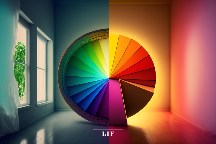
Colour temperature
One of the elements that must be taken into account when choosing a palette for the bedroom is the colour temperature.
According to this, colours are divided into warm, cool and neutral.
- Warm colours
Warm colours include shades associated with the warmth of the sun - yellow, red, orange - and earth tones, such as the brown scale, clay, and terracotta. Warm colours are intense, deep, embrace-like. Perfect for making rooms cosy and intimate - Cool colours
Cool colours are identified with various shades of blue, green and turquoise. These shades are generally used to convey feelings of relaxation, tranquillity and meditation - Neutral colours
By definition, neutral colours are those that contain low intensity and saturation. This means that they provide little energy to the rooms, but in return induce a feeling of well-being, calm and concentration
In a neutral colour palette we find all shades between white and black:
- White is the neutral colour par excellence, as well as one of the most widely used in interior design; its versatility is total (there is no colour that cannot be juxtaposed with it) and it is the ideal choice for making rooms brighter and visually larger
- Grey retains the brightness of white, while creating a more modern and sophisticated atmosphere
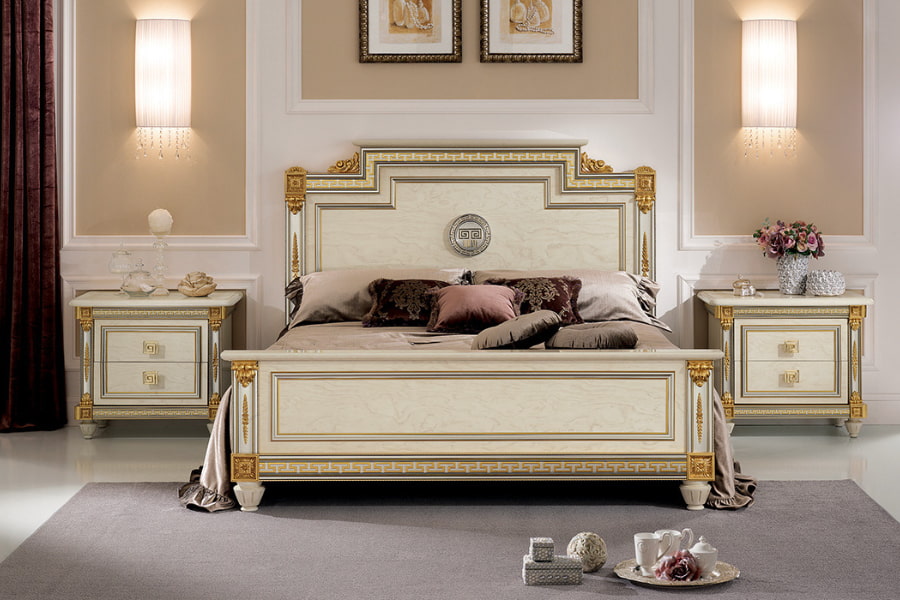
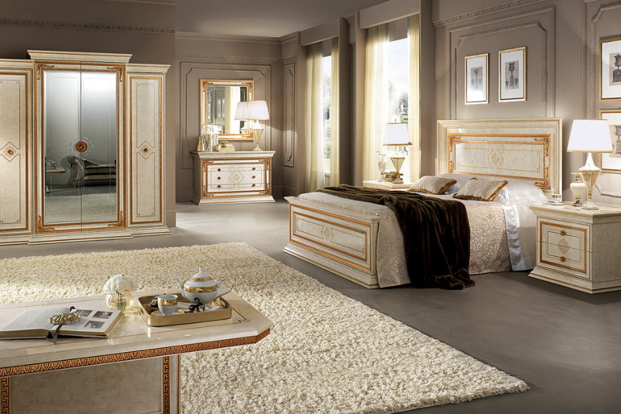
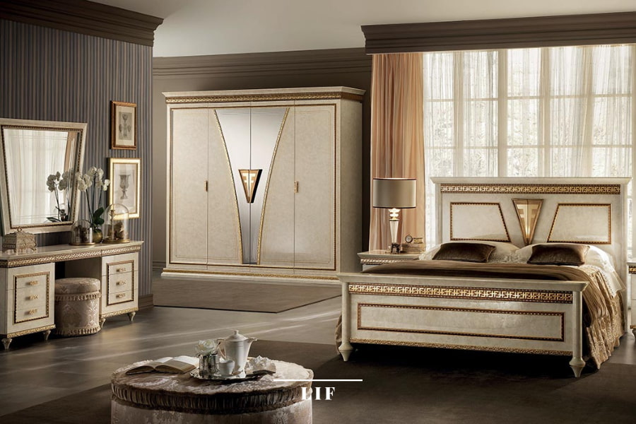
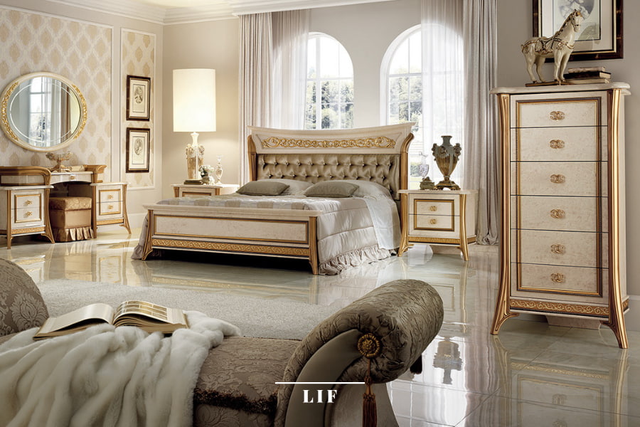
- The beige scale - as bright as white but warmer - is perfect for furnishing classic contexts with refinement, to which it lends a touch of class and a sober base for combining fine materials and precious gold, ivory and bronze finishes
- Black, like white, goes easily with most colours; like all strong colours, it should be used sparingly by playing with contrasts

The interpretation of colours in interior design
In interior design, the tendency is to classify colour shades not so much on the theoretical basis of Itten's circle, but on the final effect achieved in a room by using certain colours or combinations thereof.
In particular, there are four effects resulting from the use of colours:
- Monochrome
A monochrome environment is one in which the same colour, used tone on tone, playing only on shades and chiaroscuro, gives a clean, minimalist effect - Complementary
The juxtaposition of complementary colours (and their hues) creates a powerful, bold, almost alienating visual impact. Indeed, placed side by side, complementary nuances (yellow and violet, blue and orange, green and red) double their expressive power - Similar
The 'similar' effect is achieved by mixing three neighbouring colours in the colour wheel in the right proportions: two primary colours and the resulting tertiary colour.
An example would be the mixture of red, yellow and orange, where one dominates, one supports and the other highlights - Divergent complementary
You start with a primary colour and then, instead of matching it with its complementary, you choose the two colours to the left and right of the latter.
Assuming that our guiding colour is blue, the other two colours in the palette will be orange-red and orange-yellow, i.e. the two shades on the colour wheel next to orange, which is the complementary colour of blue.
This colour scheme, compared to the complementary one, creates a less extreme and, for this very reason, more effective contrast.
Not surprisingly, it is a favourite among designers: it offers great versatility and various creative ideas.
What colours should you choose for the bedroom?
Several scientific studies, including authoritative research from the Edinburgh Sleep Centre, led by Chris Idzikowski, have shown that ganglion cells, the receptors in our eyes, are more sensitive to certain colours than to others, and that each colour causes a different effect on the human brain. Some tones induce a sort of euphoric state, while others convey calmness and conciliate rest.
For obvious reasons, restful shades are preferred in the bedroom, as they positively influence the hours and quality of sleep.
Warm or cold, it doesn't matter. What matters is that they are soft, delicate colours, 'discharging' energy, so as to induce stimuli of calm, well-being and relaxation.
Which shades are most suitable for the bedroom?
The winning colour for bedroom walls is blue, at least according to science: "Ganglion cells," explains Chris Idzikowski, "provide information to a deep area of our brain that controls vital rhythms throughout the day, and affect our performance. We have proved that these receptors are very sensitive to the colour blue'.
Right after blue we find green and yellow, while at the bottom of the list of 'calming' colours we have is purple, an energetic colour that activates brain activity instead of 'switching it off' to promote sleep.
Another suitable colour for walls is grey, although it may seem cold and impersonal for an intimate environment such as a bedroom. Grey instils a pleasant feeling of calm and, at the same time, gives the room character, as we see in the Leonardo Collection of Arredoclassic.
5 Tips for matching bedroom colours
Taking into account the characteristics of colours and the feelings they convey to people both visually and emotionally, and knowing the stylistic effects that can be achieved by combining the various shades with each other, is only the first step in creating chromatically harmonious environments that are congruent with the target environment.
This is just the theory. Putting it into practice is quite another matter; in addition to technical knowledge, other factors come into play, such as personal taste, intuition and the assessment of specific needs that can influence the choice of colours, whether for the bedroom or any other room.
Let's take a look at 5 tips to help you create the right colour moodboard for an intimate, cosy and restful bedroom.
1. Always indulge your taste
While it is important to follow schemes and styles when choosing colors, so as to create an effect that does not look bad (careful, because this can happen with neutral or subdued colors, too), the first step is never to ignore your own taste.
Choose a series of colors that you prefer, put them together (all or some) in various ways and this will allow you to find the best colors for your bedroom.

2. Create a functional sleeping environment with the monochrome scheme
The main role of the bedroom is to promote comfort, relaxation and rest.
As mentioned earlier, It is important to give priority to restful, muted tones, those known to induce calm and peace.
The most suitable colour scheme for creating a relaxing atmosphere is monochrome, although a well-balanced ambience can also be created by blending two primary colours and the resulting tertiary colour, as in the 'analogue' scheme.
3. Opt for pastel shades
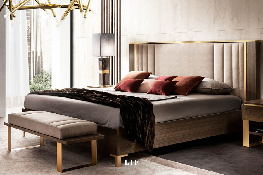
The dominant colour of the bedroom should not only be restful, according to the scientific parameters mentioned above, but also subdued. It is precisely the subtle hues that give the room the calming and relaxing effect it needs. Instead, bright, intense and dark colours should be avoided.
So, for example, for blue we could opt for pastel shades, with a muted, dusty effect, like sugar paper. If we wanted to go for green, we would choose an elegant sage green or a romantic teal instead, rather than energising shades such as acid green or emerald green.
Warm neutrals such as powder pink and ecru are also good for walls, while total white may be too aseptic and convey a sense of emptiness and uncertainty.
White and ivory, on the other hand, are suitable shades for furniture and accessories, especially when combined with precious metal finishes (gold, bronze, silver) and precious woods, when you want to connote the bedroom in a refined and luxurious key.
4. Opt for a clean, essential style
In the bedroom, colour balance is to be sought in every element, from walls to furniture, from textiles to accessories, passing through the decorative objects and the lighting system, so that the end result is clean and minimal.
As already noted, the visual impact must be restful and harmonious.
This does not mean, however, that you can’t also include some bright shades to create focal points that accentuate the style and originality of the composition.
5. When in doubt, choose neutral colours
All neutral colours offer a wide variety of nuances and effects, definitely not boring as some people may mistakenly think.
Whether neutral colours are the main protagonists of your bedroom colour scheme or highlights to refine it, they bring with them a unique, elegant and accommodating versatility: ideal for your rest. Gray is a great ally for this purpose.
How to choose bedroom colours based on furniture
Restful colours, such as blue, are easy to match and never go out of fashion. With walls in a pastel shade of the blue scale, it will be easy in the future to change the atmosphere of the bedroom by intervening only on the furniture or accessories.
Whether you have opted for a classic-style bedroom, such as that of the Fantasia Collection, or for a more contemporary mood, like the Essenza bedroom by Adora, it is important that the colour of the walls, the furniture and the various decorative objects dialogue harmoniously with each other, matching each other with spontaneity and balance.
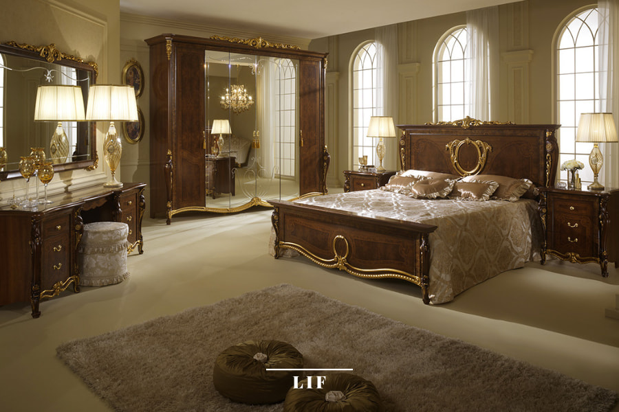
What colours go well with dark bedroom furniture?
If the furnishings in the master bedroom are dark, you should pay attention to the wall colour, which, by contrast, should be light so as not to weigh down the room but, on the contrary, add lightness and brightness.
So opt for light and neutral walls, with beige or dove grey as the ideal shades. An example can be seen in the Donatello Collection.
You can also choose to go for classic white, bringing more brightness to the room. In this case, however, you should take care to include pictures and wall decorations that can warm up the atmosphere.
What colours go well with light bedroom furniture?
If, on the other hand, you have chosen light-coloured furniture and accessories, you will have more freedom for the walls, ranging between brighter shades than the usual neutrals. Always with caution: remember that bright or too dark colours do not suit the bedroom.
In a modern style, you could paint the walls blue or green, while for a classic bedroom you could go for shades such as sand, ivory or grey. You can see an example of this in the Melodia Collection.
Are you seeking inspiration for decorating your interiors?