
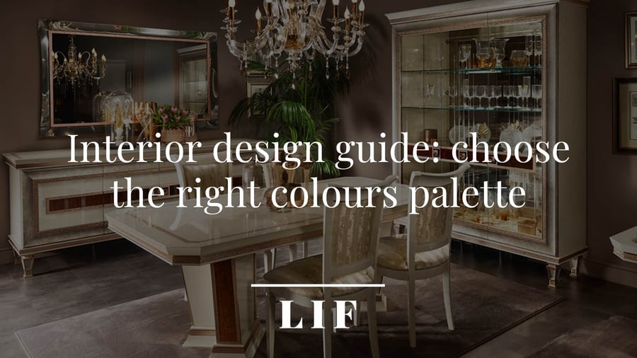
When beginning to imagine the style and colour palette of an interior, it is essential to carefully ponder all the elements involved.
Specifically:
- The structural characteristics of the room, i.e. its shape and size
- The level of brightness (exposure to the sun, number of windows)
- The function of the room (living area, sleeping area, service area)
It is not advisable to choose the guiding colours of a room without taking these 3 factors into account.
You should also consider that it is not always possible to turn a room upside down with a total renovation. Sometimes, we will be limited to a stylistic makeover and a change of furniture. In the latter case, the pre-existing elements of the home (floors, walls, fixtures) will influence the choice of our colour palette.
These considerations can help you do a good job in terms of style and colour; however, you shouldn’t forget that when choosing colours, it is also essential to indulge in your personal taste, not to mention the compromises you will have to make for the reasons stated above.
In this article, we will start with the theoretical basics of colour characteristics, and then delve into practice to see how to choose the most suitable palette and colour scheme for different interior design projects.
- Choosing the right colour palette: Itten's colour circle
- Warm and cold colours: how to distinguish them
- Colours in Interior Design
- How to choose the colour scheme
- Combining colours to create balance
- How to choose the right colours for your interior design project
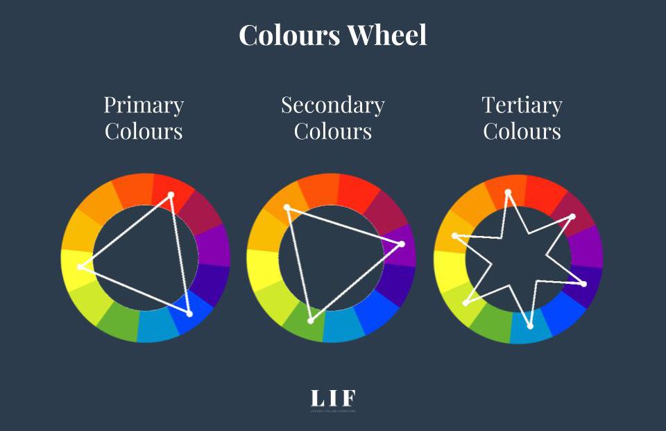
Choosing the right colour palette: Itten's colour circle
Itten’s colour circle, named after its creator, Swiss painter and designer Johannes Itten, provides the theoretical basis from which to choose a colour palette for the living room, bedroom and any other room in a home.
With his research, Itten did not just classify colours; he also analysed them in their physical-chemical properties to find out what effect each hue has on the human eye. Sight, in turn, triggers emotions and moods.
Through his studies, Itten showed that some colours elicit moods such as joy, euphoria and vitality, while others induce a sense of peace, well-being and relaxation.
Before delving into the colour-emotion link, which is also affected by the colour temperature, let us see how the Itten circle is structured and how colours are divided.
Structure of Itten's colour circle
In the centre, there is a triangle formed by the 3 primary colours (yellow, red and blue). The triangle, in turn, is placed inside a hexagon, the sides of which form three triangles representing secondary colours.
The latter are placed in correspondence with the result of mixing the two primary colours. For example, we will find orange covering the side of the triangle where yellow and red are.
In the outermost part, there is the circle of tertiary colours, i.e. those resulting from the combination of a primary and a secondary.
In short, we have:
- Primary: red, blue and yellow. These are the pure colours that cannot be created to mix with others
- Secondary: orange, green and purple. They are made by mixing 2 primary colours in equal parts (yellow and blue create green for example)
- Tertiary: these are 6 colours that are created from a mix of primary and secondary colours
The colour wheel is a valuable ally for understanding how to mix and modulate colours to achieve shades that suit each room, which combinations are most harmonious and which create the most successful contrasts. However, to create the atmosphere of an environment, one important element is missing: emotions.
And this is where colour temperature comes into play.
Warm and cold colours: how to distinguish them
We can say without any doubt that each of us knows of the existence of cold and warm colours and therefore “temperature” with respect to shade. Yet there are few that can recognise the differences and how to tell them apart. The reason for which we don't immediately see the connection if we read that a warm tone would be perfect for a living room whilst a colder one is suitable for the bedroom.
So, let us first see which are the warm tones and which are the cold tones.
Warm colours
Yellow, red and orange are reminiscent of the sun and fire: they are colours that literally warm us up, evoking feelings of warmth, sharing and welcome. Warm colours are associated with passion, energy, life force, joy.
This is why, almost instinctively, we tend to use them in living areas and sunnier rooms.
In the living room, for example, warm colours make their appearance in the form of furnishings (curtains, carpets, cushions, poufs), creating a nice contrast with furniture in wood colours and walls in so-called 'warm neutrals':écru, sand and other shades of beige.
Warm shades also include precious metals, such as gold, brass and copper, which add an aura of luxury and sophistication to the warmth.
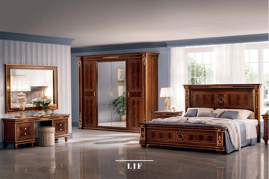
For example, in the living room of the Donatello collection by Arredoclassic, the walnut finishes of the furniture blend elegantly with the decorative friezes in gold leaf and with the gilded objects (the candelabra, the teapot), while the neutral base of beige for the walls, curtains and carpet gives balance and understatement. The result is a warm yet sophisticated composition in classic Italian style.

Cool colours
We have seen that, for the most 'active' and busy rooms in the home (living room, kitchen, dining room), warm and energetic colours work best. Colours such as yellow and orange, which put us in a good mood, or shades of red, which instil grit and start the day on the right foot.
Quite a different matter for the bedroom, the place where we take refuge to, at the end of the day to relax and rest. As can be guessed, the most suitable for bedroom walls are restful, chromatically 'dull' tones, capable of instilling calmness and conciliating sleep.
Cool colours, in particular blue and green, or neutral colours such as beige and grey are the most suitable. Be careful, however, not to choose shades that are too dark, which darken the room, or too bright, because they generate an energising effect similar to that of warm colours.
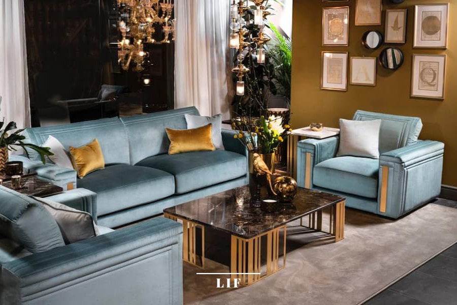
The best nuances are light, soft, dusty shades: turquoise, sugar paper, teal, but also powder pink and pastel shades of purple (lilac, lavender).
In this composition of the Modigliani bedroom, an elegant vertically striped wallpaper was chosen for the wall behind the bed, and for the other walls a sophisticated ashlar with frames, using different shades of blue, from the soft aquamarine of the wallpaper to the deep blue of the ceiling fret.
Choosing between warm and cool colours
As noted in the introduction, in colour choices it is not always possible to fully indulge in our taste or to treasure the teachings of the Itten circle.
There are mainly two factors that can skew our choices:
- The square footage of the room
- Its degree of brightness
If, for example, we want to create a cosy and sunny ambience by choosing a warm palette for the living room, but the living room is not very bright and/or small in size, a good designer might suggest focusing on light and bright colours, such as white and ivory, although at first glance they may seem cold and impersonal for the living room.
To make rooms more spacious and bright, colours are not the only thing we can use. We can also rely on materials and accessories.
Going back to our example, the light shade of the walls could be combined with materials in a glossy finish (lacquered, marble finishes, etc.) and reflective surfaces, such as mirrors, to give the room a striking perspective illusion.
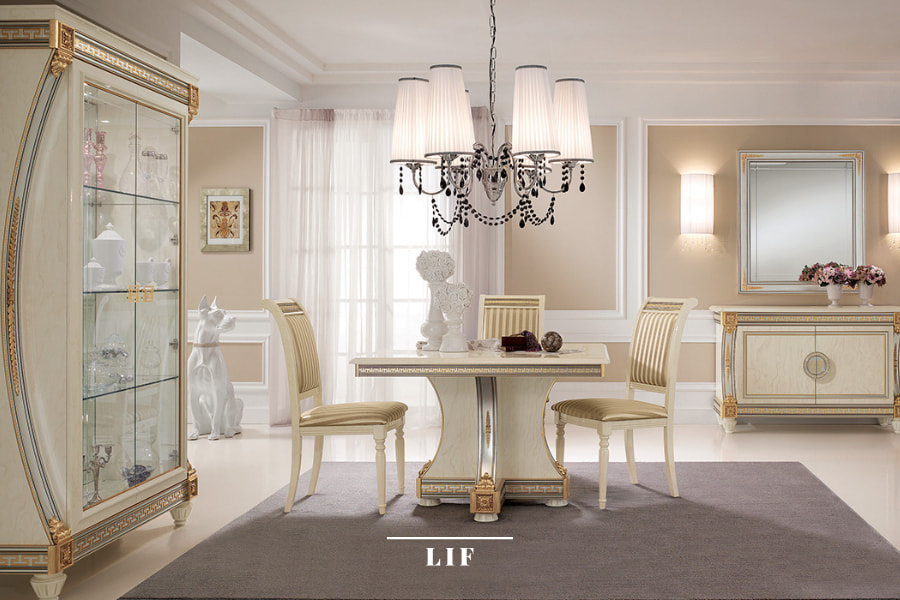
To warm up the atmosphere, you can also play on details. In this refined and bright dining room from Arredoclassic's Liberty collection, the overall impression is anything but cold. The large, dark carpet, contrasting with the shiny, light-coloured floor, the golden friezes on the furniture, the walls in earthy colours and the decorations on the chandelier are stylish details that make the atmosphere cosy and ethereal at the same time.
Colours in Interior Design
Shades can be made brighter, softer, darker or brighter on different scales, using neutral colours - white, black and grey - to create numerous variations of the same base.
Specifically:
- Tinting, when the colour is made lighter by adding white to it
- Shading, when the colour is made darker by adding black to it
- Softening, when a dark tone is softened through the use of grey
Here again the chromatic circle comes into play. Red, orange and yellow are preferred amongst the warm colours for their ability to make a space intimate and vibrant. On the other hand, blue, purple and green - the cold colours - bestow a more relaxing and tenuous feel.
As stated above, it is a choice that is made based on the function of the interior you wish to colour and the space itself. The choice of a "cold" colour in a wide space could create a sense of desolation that is far from ideal.
How to choose the colour scheme
Having seen the characteristics and differences of colours and how the colour circle can be used, it is now time to choose the right palette and the scheme to define it.
Interior design identifies four types of colour schemes that can enhance a room.
1. The monochrome scheme
In monochrome schemes, based on the use of a single hue, nuances play an important role. It is thanks to them and the effective use of light and chiaroscuro that it will be possible to emphasise the features of the furniture and create harmonious, understated and elegant environments.
2. The complementary scheme
The combination of complementary colours (and their nuances) is for those who, on the other hand, wish to achieve a more eye-catching effect than the visual cleanliness of the monochrome scheme.
More eye-catching, but also more risky: two complementary shades, such as yellow and purple, or blue and orange, are not easy to match.
A softer complementary scheme is the so-called 'split' version: instead of choosing diametrically opposed colours in the circle, one opts for two respective shades, thus softening the contrast.
3. The similar colours scheme
The analogous (or harmonic) colour scheme is based on the choice of three colours placed in a row in the Itten colour circle: usually two primaries and a third, created by mixing the two.
This scheme creates a calm atmosphere without contrasts. If opting for similar colours, you should choose a dominant colour with a neighbouring colour as support, while the third will be used for details.
It is important to carefully evaluate the proportions of the three colours: which one dominates, which one supports and which one accentuates, trying not to exaggerate in one direction or the other.
Examples of similar colours are white, black and grey.
4. The contrasting colours scheme
A high-contrast pattern is created by three colours that are equidistant within the colour circle. A classic example is the three primary colours or the three secondary colours.
It is a very lively pattern, perfect, for example, for children's bedrooms.
As in the case of the similar colours scheme, attention must be paid to the balance between the leading colours, always opting for a dominant tone.
You can lighten the two secondary colours if you want a softer version.
Combining colours to create balance
When choosing the colour palette for a room, it is good to keep in mind what in interior design is called the '60-30-10' rule.
These numbers refer to the percentage of colour to be used:
- 60% will be allocated to the main colour of the palette: almost always used for walls and some furnishings
- 30% to the secondary colour, i.e. a colour contrasting with the main colour to give depth
- 10% to the accent colour, which has the task of enhancing the contrast through furnishings and accessories
How to choose the right colours for your interior design project
In order to choose the most suitable colour palette for an interior design project, there is one last aspect to be taken into account: the style you want to create.
Opting for a classic or a modern style will lead you to lean towards certain colour combinations rather than others.
For the classic style you can use neutral colours such as white, ivory or beige, as in the Melodia Collection.
More intense colours, on the other hand, are perfect for enhancing a more modern ambience, as in the Allure Collection.
Choosing the colour for your home is a key moment in the realisation of an interior design project.
Finding the right colour match between the furniture, walls and floor will allow you to create an ambience in line with your taste, but also elegant, refined and harmonious.
Are you looking for an elegant and exclusive design for your interiors?